Youtube
Celebrating two decades of creativity, community and culture.
Good
Sh*t Soda
A bold, playful identity system for a probiotic soda that cuts through a crowded beverage market by balancing health, fun, and personality.
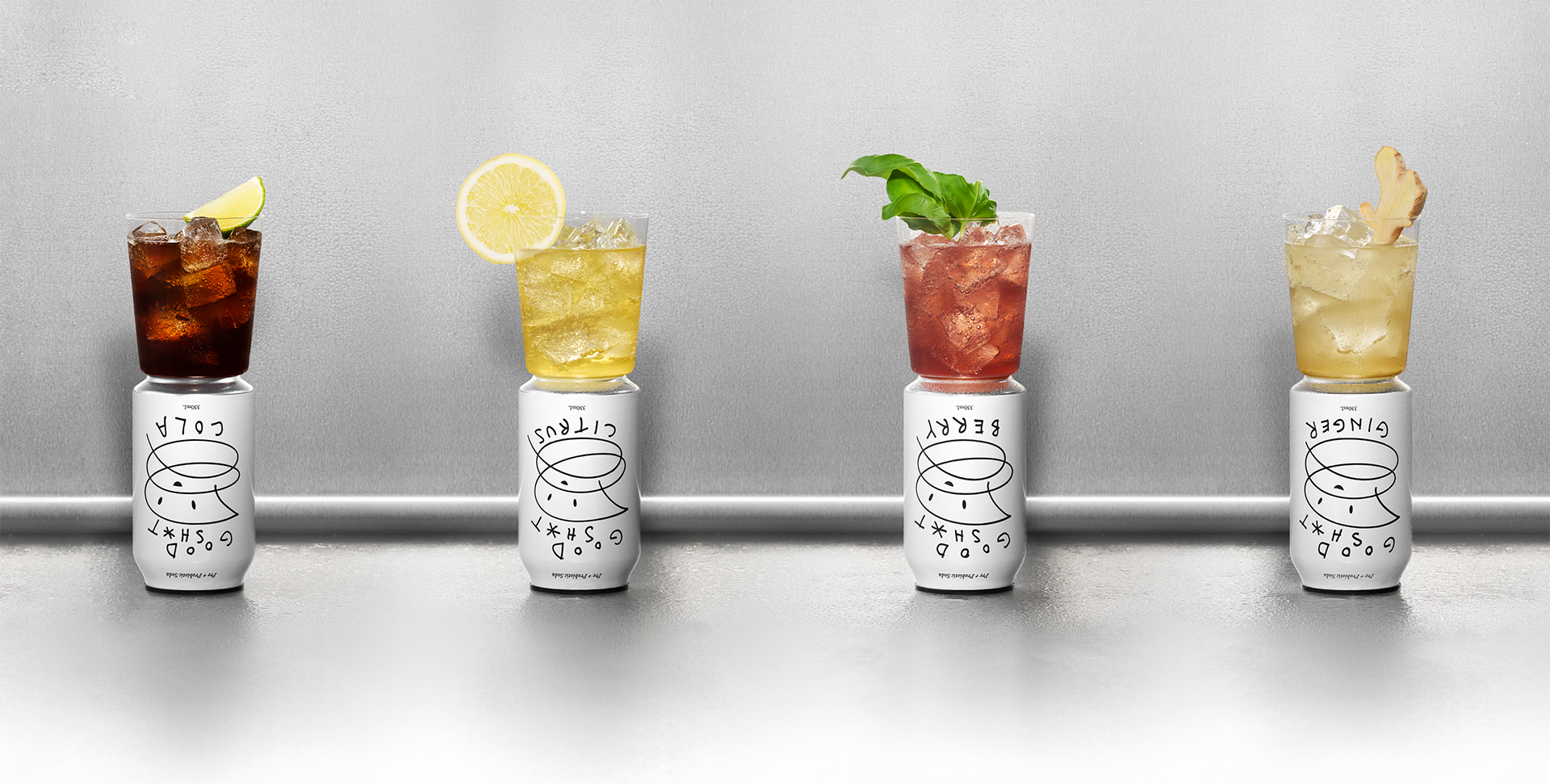
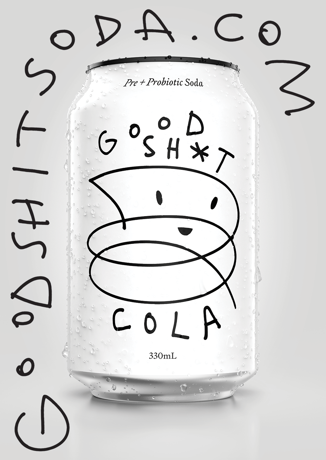
How do you stand out in an ultra-traditional category? The answer was radical simplicity. The name Good Sht* says exactly what it does—good stuff in, good stuff out. Matter-of-fact, memorable, and disruptive, the brand needed to reflect the product’s irreverent attitude while clearly communicating its benefit.
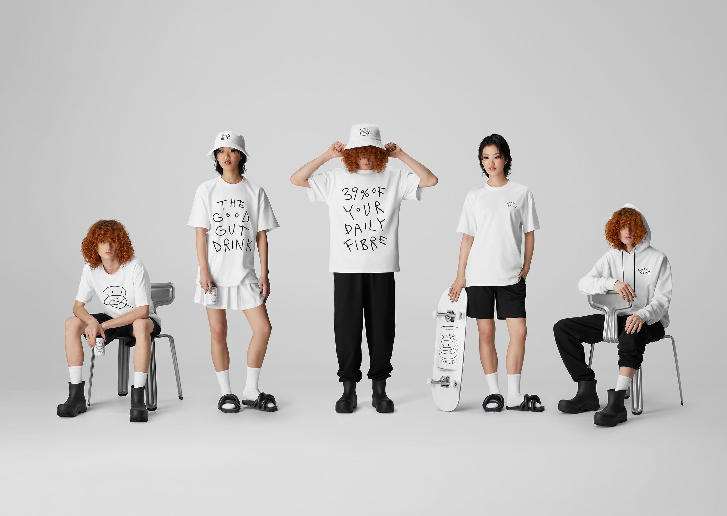
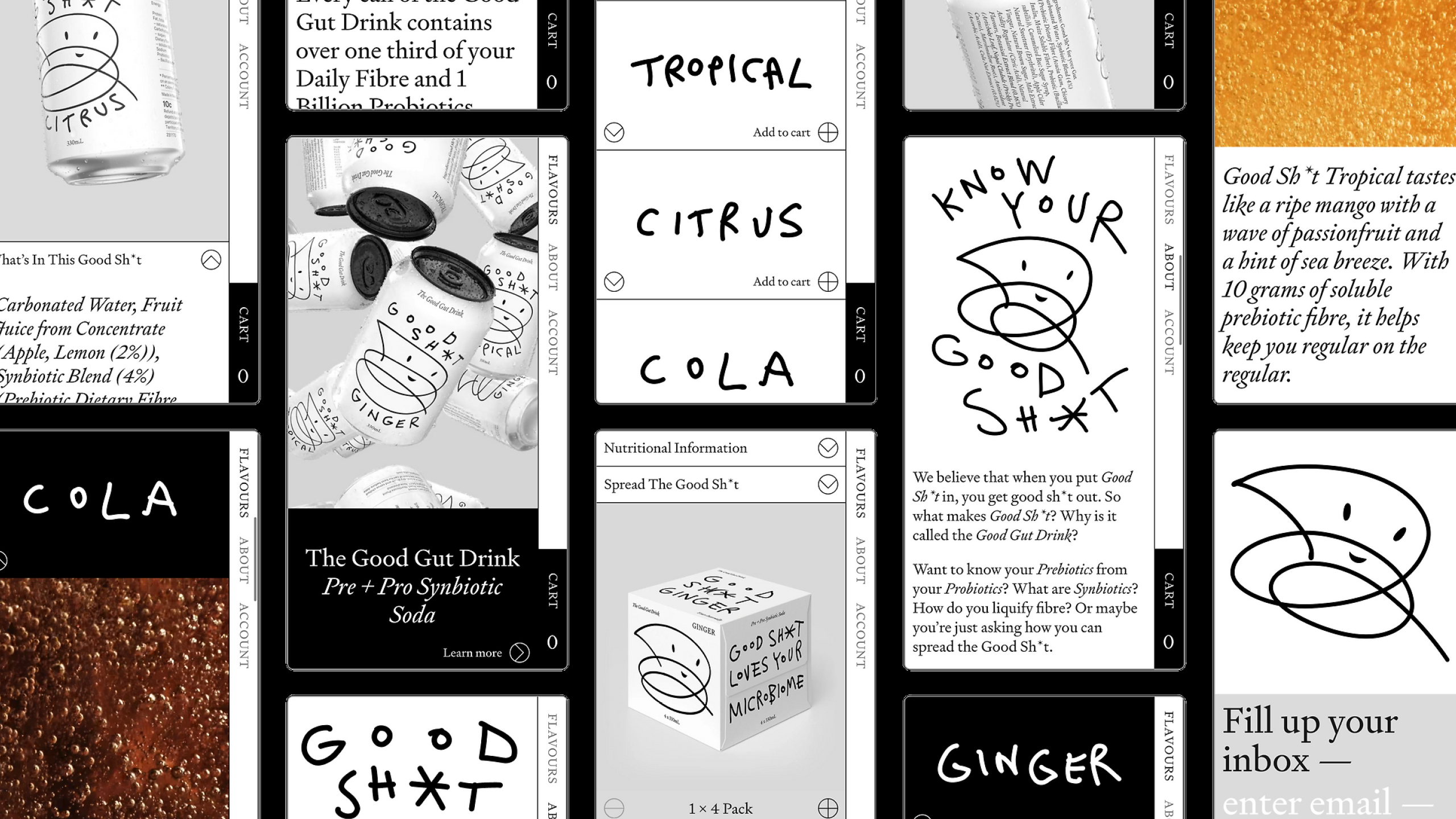
Solution Built around colour, type, and logo—with shelf presence front of mind—the product was packaged in a can to signal a fizzy, everyday soda rather than a supplement. A strict black-and-white palette ensured strong shelf impact against competitors’ colourful packaging. Bespoke hand-drawn type, illustrations, and the iconic “Poot” added authenticity and humour. Every execution is unique—from individual cans to packs, shippers, ads, and digital—reinforcing movement, individuality and the idea that everybody is different.
Outcome Since launch, Good Sh*t Soda has doubled sales year-on-year and is now stocked nationwide across major NZ retailers including Countdown, Foodstuffs, and Farro Fresh, as well as hospitality venues, with international distribution underway.
Outcome Since launch, Good Sh*t Soda has doubled sales year-on-year and is now stocked nationwide across major NZ retailers including Countdown, Foodstuffs, and Farro Fresh, as well as hospitality venues, with international distribution underway.


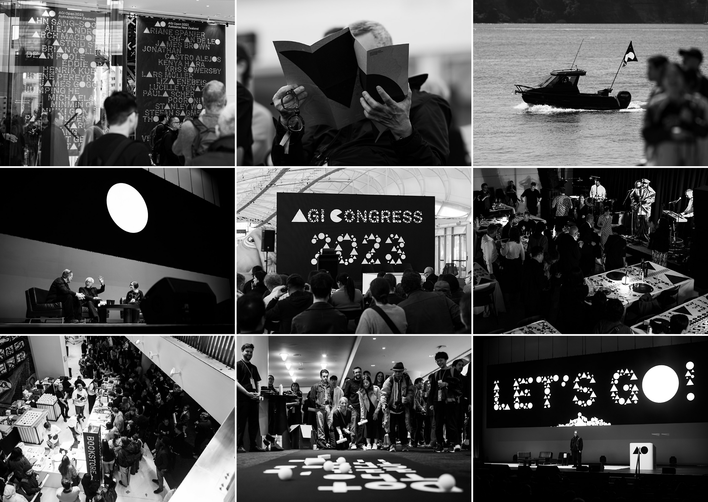
AGI
Aotearoa
2023
An international design event connecting the global AGI community with creatives across Aotearoa New Zealand.
Held in Auckland for the first time, AGI Aotearoa New Zealand sought to inspire the local design community while introducing a globally recognised organisation with low local awareness. This was compounded by limited communications infrastructure and a post-COVID economic climate.
Awards + Press
→ Gold — Large Brand Identity
→ Gold — Design Communication
Creative Director
Dean Poole
Design Directors
Rei Konza
Tim Gomez
→ Gold — Large Brand Identity
→ Gold — Design Communication
Creative Director
Dean Poole
Design Directors
Rei Konza
Tim Gomez
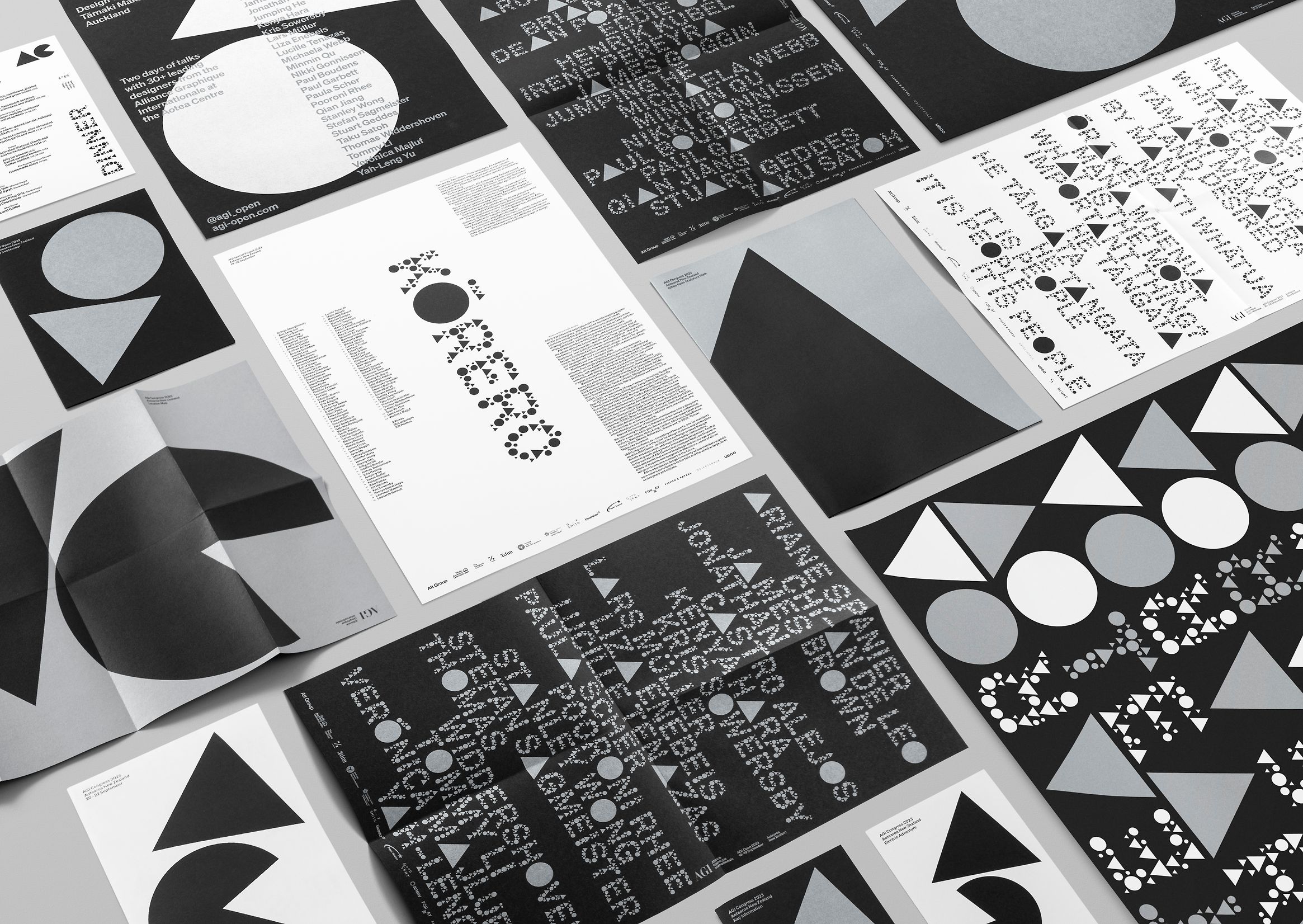
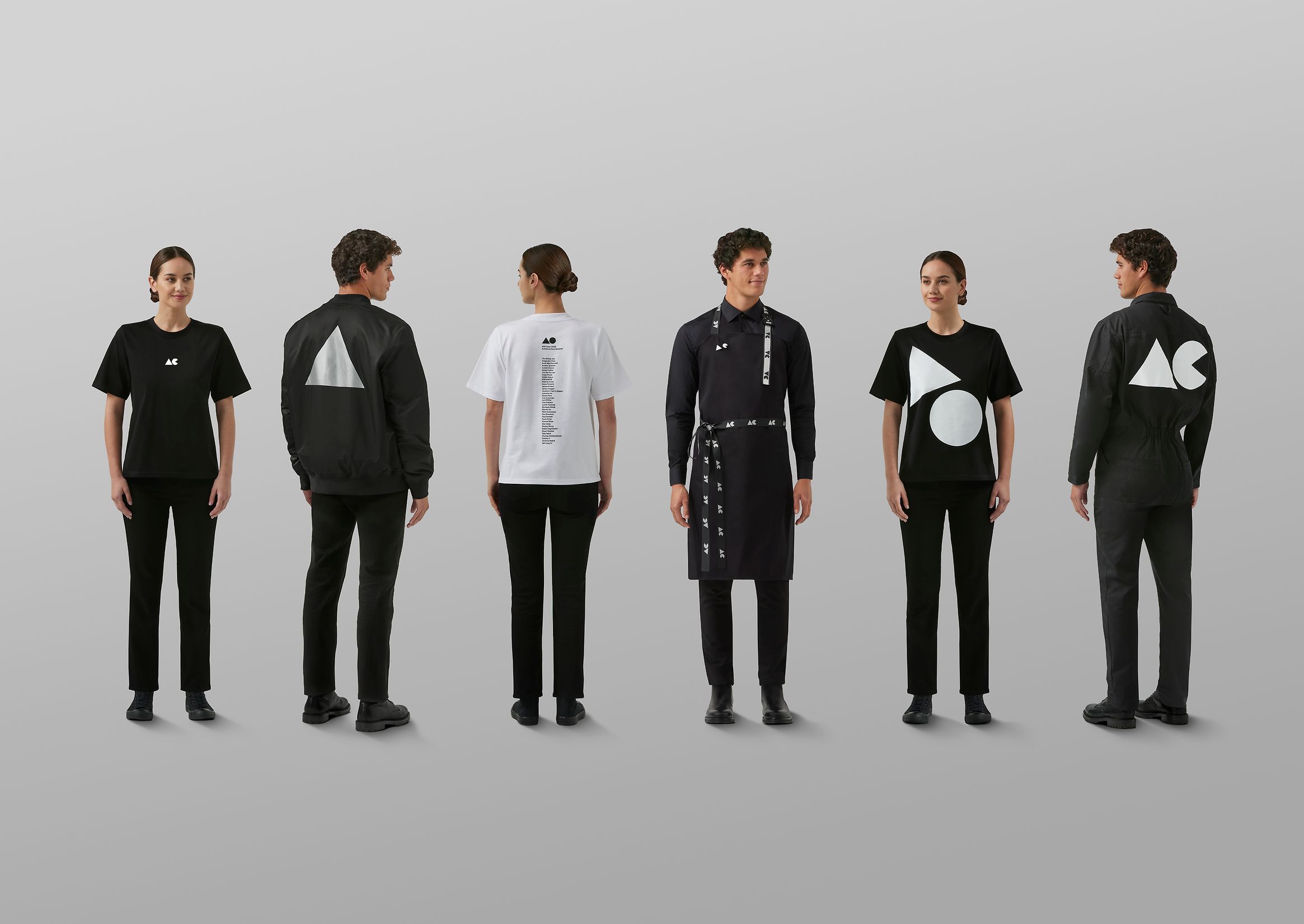
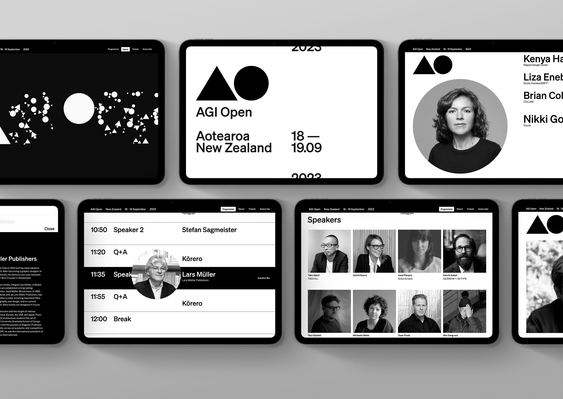
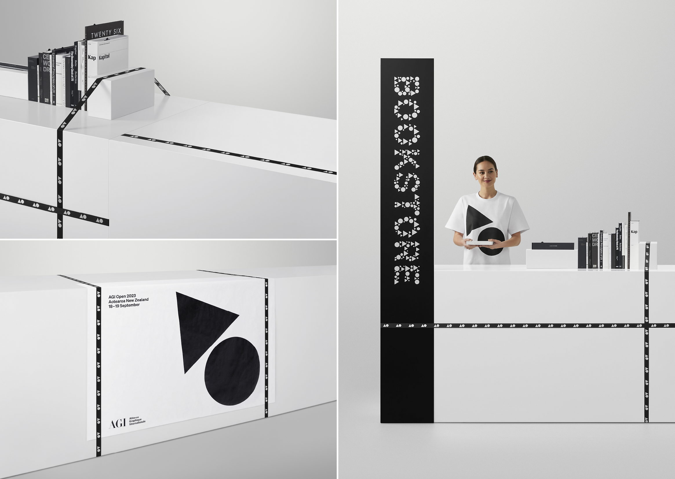
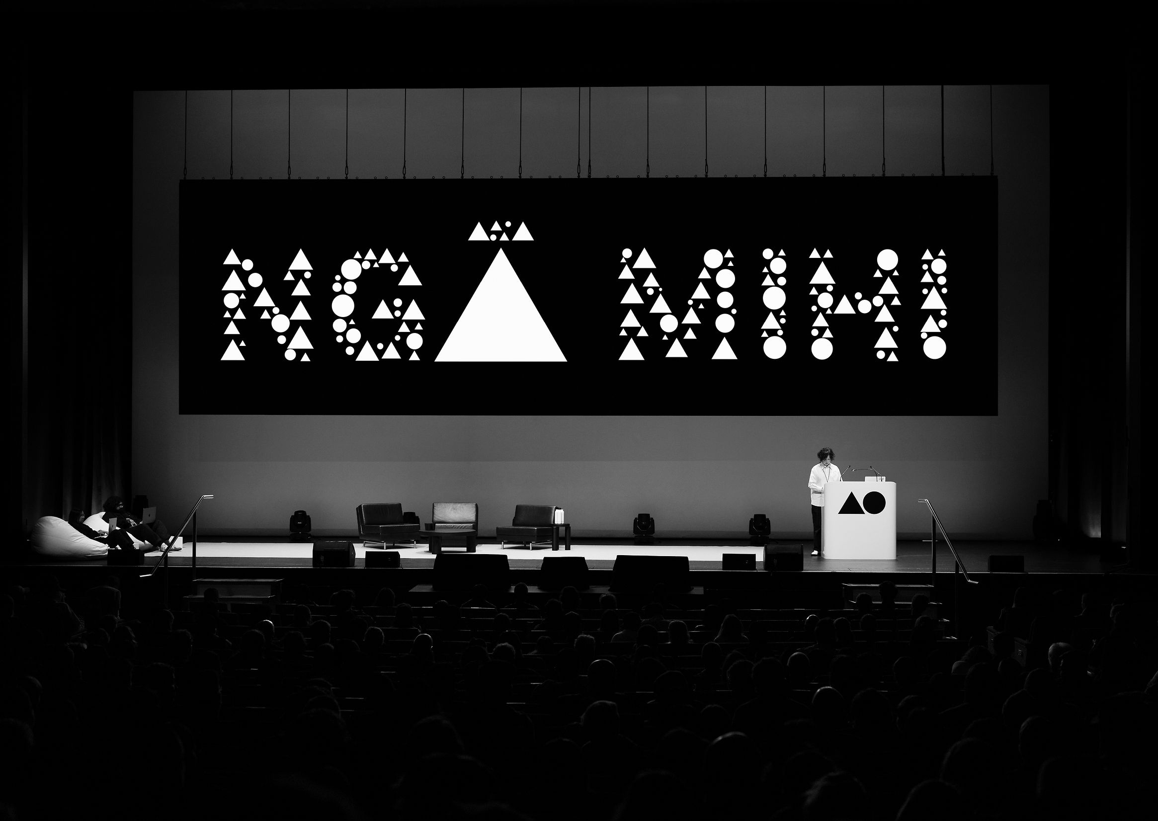
Solution The event centred on Kōrero—conversation as a bridge between cultures and ideas. A flexible communications system was developed to build awareness and engagement across AGI Open and AGI Congress. The existing AGI identity was reinterpreted for a local context, drawing on Swiss Style principles, geometric forms, and a rigorous grid system.
Language sat at the heart of the work, supported by the custom AGI Typewriter app, which generated letterforms from triangles and circles to create a distinctive, unified visual language. AGI Open brought global practitioners together with the local community, while the three-day Congress focused on cultural immersion, celebrating indigenous knowledge, creativity, and storytelling across Aotearoa and the Pacific. The identity was rolled out across digital, print, PR, and sponsorship touchpoints to create a cohesive and immersive experience.
Outcome The event sold 88% of it’s ticket capacity. The paid digital campaign across Google and Meta generated over 4 million impressions. The @agi_open account was tagged in 1,000+ posts, stories, and reels, engaging 331,000 new accounts before, during, and after the event.

Instagram
Button Press
Celebrating creators who take the leap.
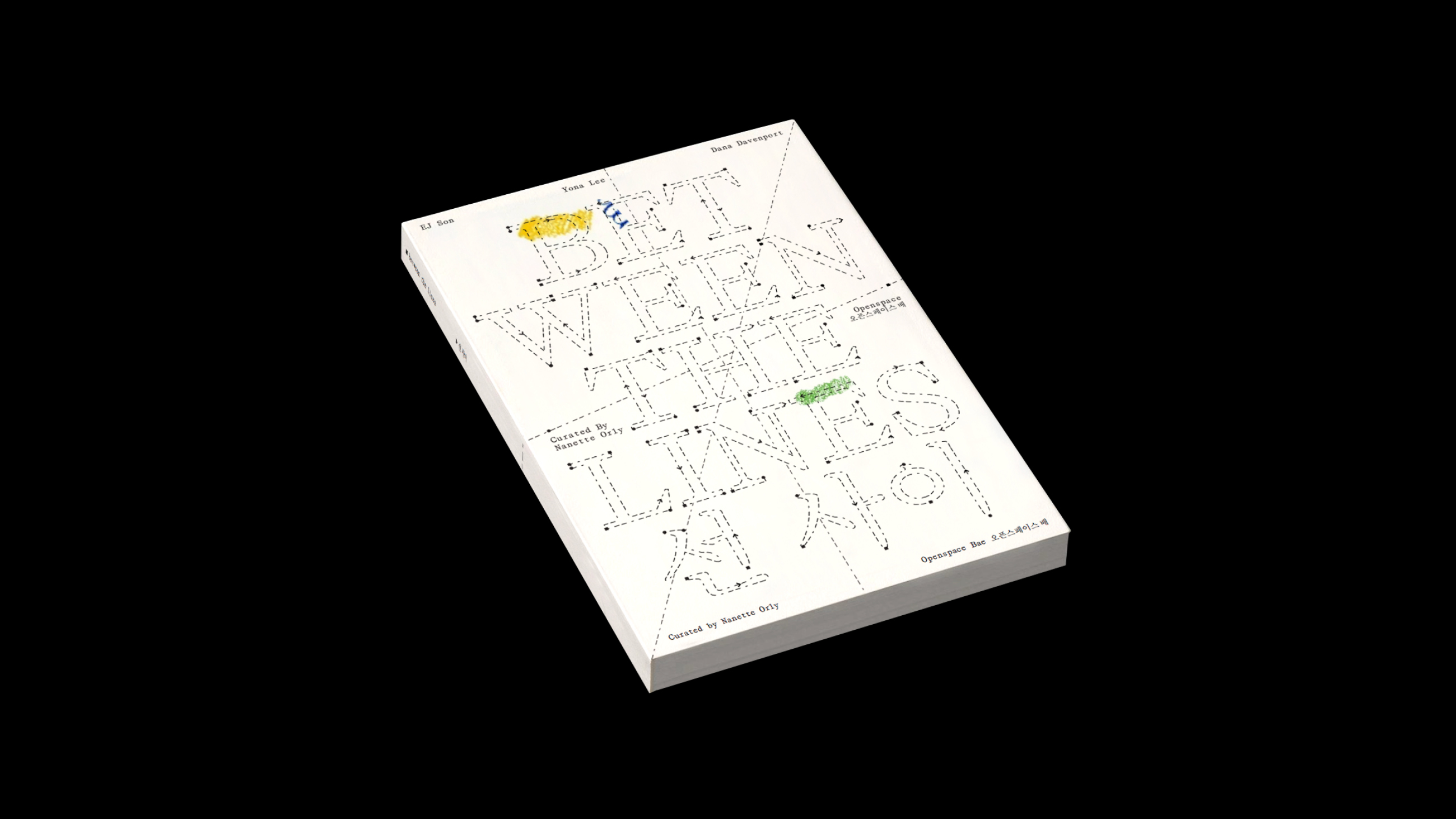
Between
the Lines
An exhibition identity reinterpreting Korean diaspora and cultural connection.
Curator
Nanette Orly
Creative Director
Jungie Choi
Nanette Orly
Creative Director
Jungie Choi
Between the Lines is a curatorial project exploring cultural connection, embodiment, and reinterpretation through contemporary sculpture. Presented at Openspace Bae in Busan, the exhibition and residency showcased new works by EJ Son, Yona Lee, and Dana Davenport—artists with cultural ties to South Korea whose formative practices developed abroad, based in Sydney, Auckland, and Los Angeles. The identity reflects the concept of non-linear diaspora. Composed of dotted lines, the branding visually represents fluid and evolving identities. For the exhibition publication, audiences were invited to draw on the book cover, ensuring each copy became unique—mirroring how diasporic identity is never fixed or linear.
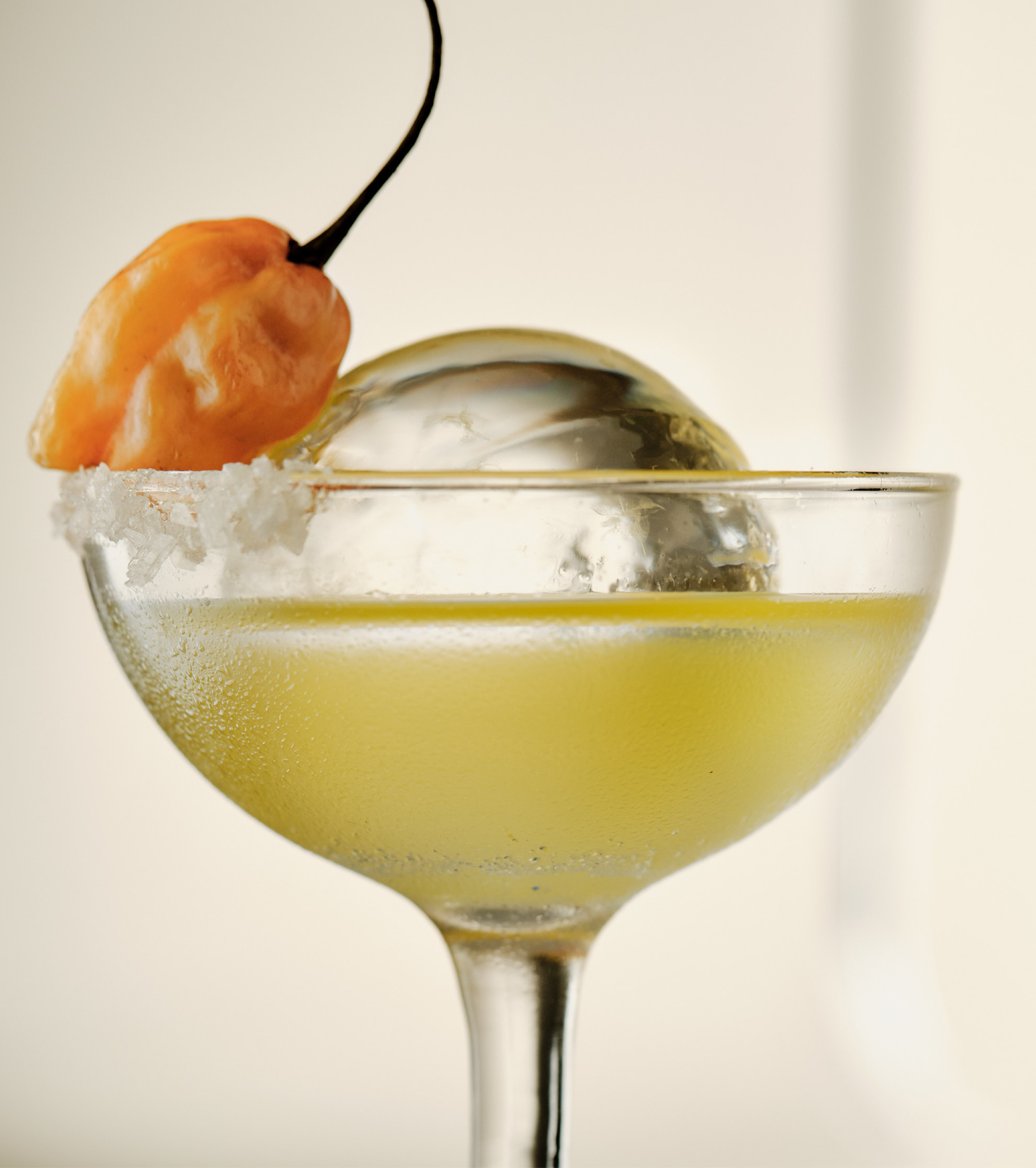
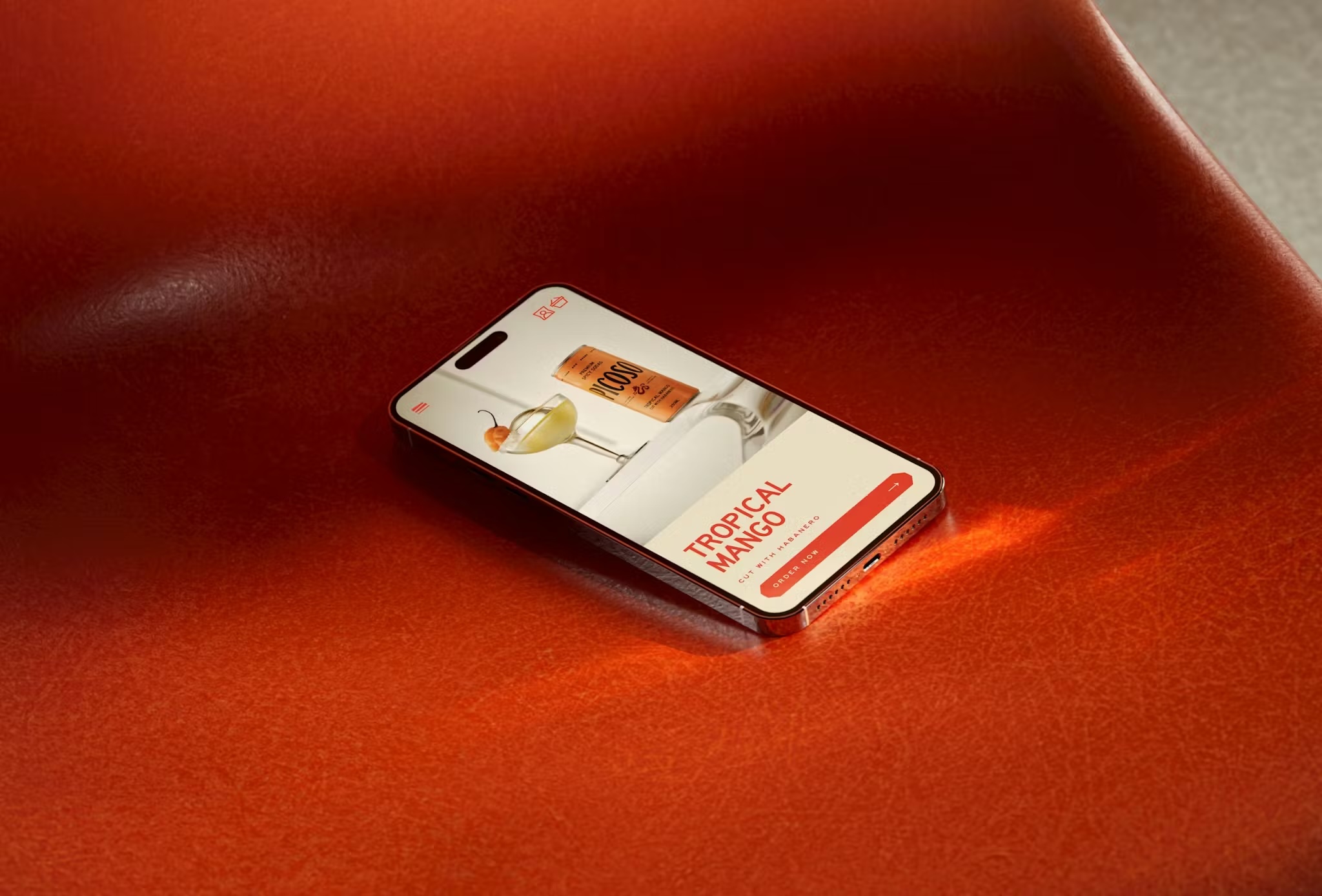
Picoso
Premium spicy soda that cuts through the market.
Picoso is a refreshing spicy soda created for people who want more than the tepid choices of alcohol or overly sweet soft drinks. Enjoyed on its own or stirred into a cocktail, Picoso stands apart—defining its own space rather than conforming to an existing category.
The bespoke wordmark commands the can with confidence. Its letterforms feature unexpected cuts and sharp angles that introduce energy and edge, echoing the drink’s spicy character. The deliberately stretched proportions give Picoso strong shelf presence while signalling a premium and crafted sensibility —confident and designed to be noticed.
The bespoke wordmark commands the can with confidence. Its letterforms feature unexpected cuts and sharp angles that introduce energy and edge, echoing the drink’s spicy character. The deliberately stretched proportions give Picoso strong shelf presence while signalling a premium and crafted sensibility —confident and designed to be noticed.

Gaja Gwaja
가자과자
Translating Korean cuisine for Aotearoa.
Awards + Press
→ Bronze — Small Brand Identity
Design Director
Jungie Choi
Team Members
Rosabel Tan
Ruby White
Yutak Son
→ Bronze — Small Brand Identity
Design Director
Jungie Choi
Team Members
Rosabel Tan
Ruby White
Yutak Son
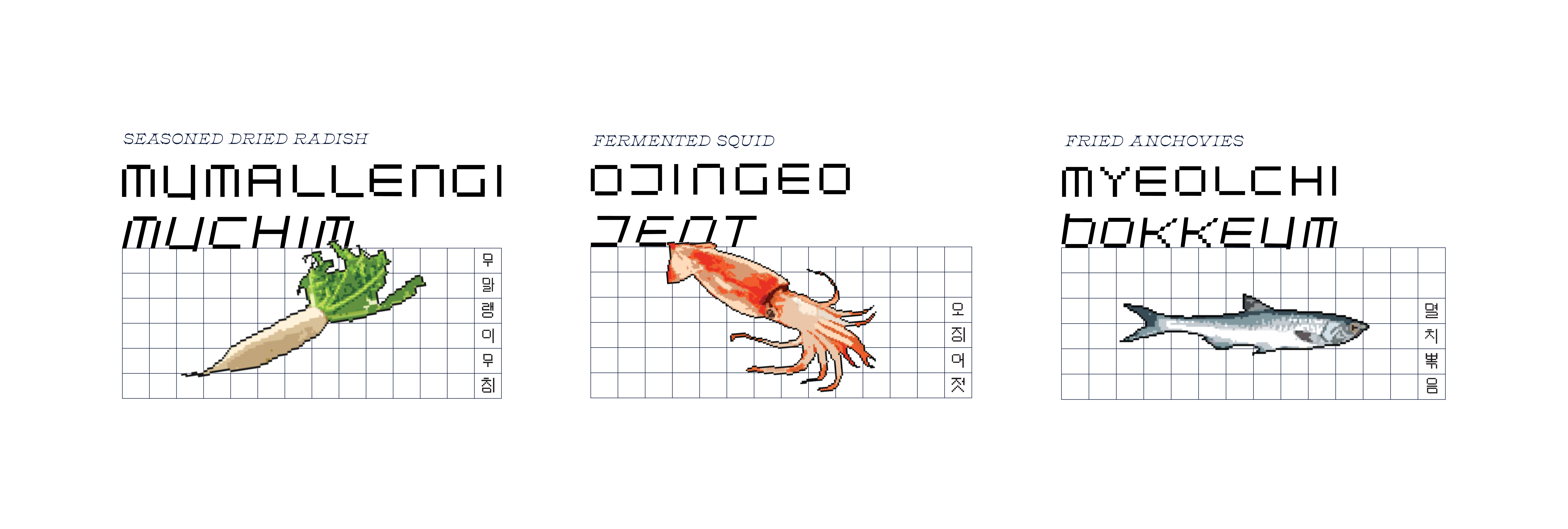
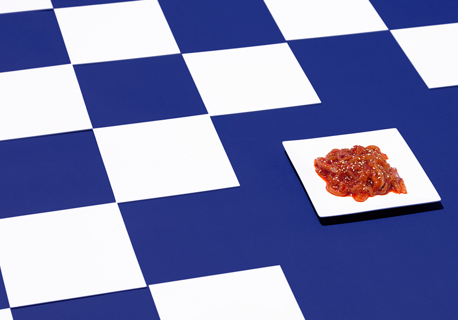
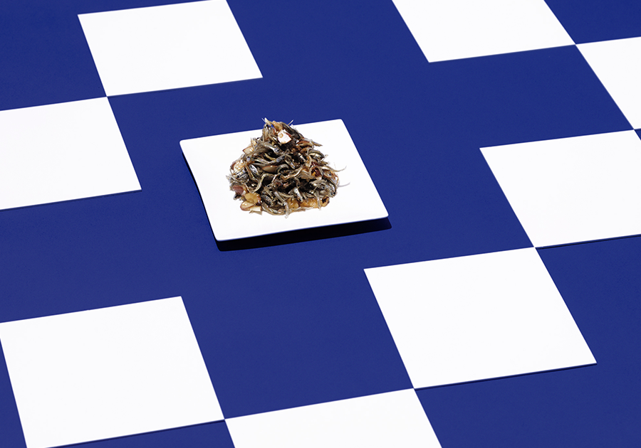
Gaja Gwaja Banchan 가자과자 반찬 is the second collaboration with the Korean Consulate celebrating Chuseok (Korean Thanksgiving) during lockdown. Each box contains six traditional banchans, meant to be enjoyed with recipients’ bubbles.
The design explores digital spaces where Korean diaspora and Tau Iwi connect with family, stories, recipes, and culture, using a custom bilingual typeface and pixelated illustrations. The project addressed a uniquely diasporic challenge: how to present a contemporary twist on a traditional holiday to a non-Korean audience in Aotearoa—during a rise in anti-Asian sentiment—while respecting cultural integrity. Drawing inspiration from Minhwa, traditional 16th-century Korean folk art, the design uses bold colours, surface decoration, and simplified motifs to balance heritage with a modern, accessible aesthetic.
The design explores digital spaces where Korean diaspora and Tau Iwi connect with family, stories, recipes, and culture, using a custom bilingual typeface and pixelated illustrations. The project addressed a uniquely diasporic challenge: how to present a contemporary twist on a traditional holiday to a non-Korean audience in Aotearoa—during a rise in anti-Asian sentiment—while respecting cultural integrity. Drawing inspiration from Minhwa, traditional 16th-century Korean folk art, the design uses bold colours, surface decoration, and simplified motifs to balance heritage with a modern, accessible aesthetic.


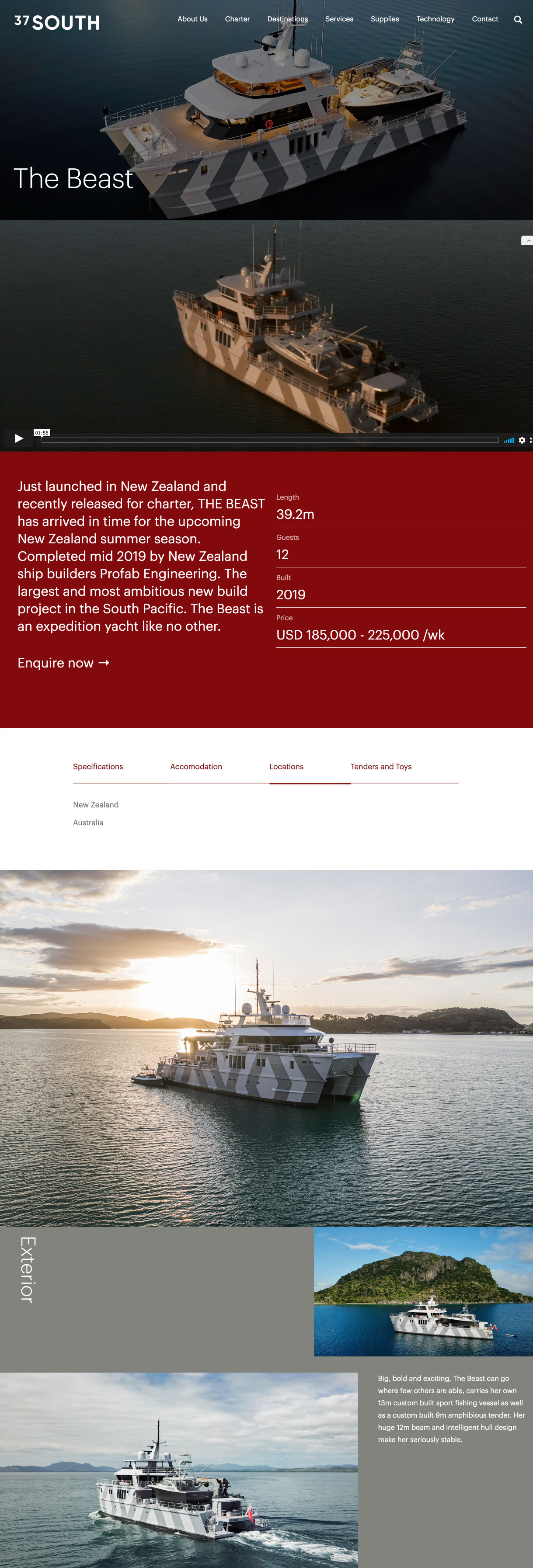
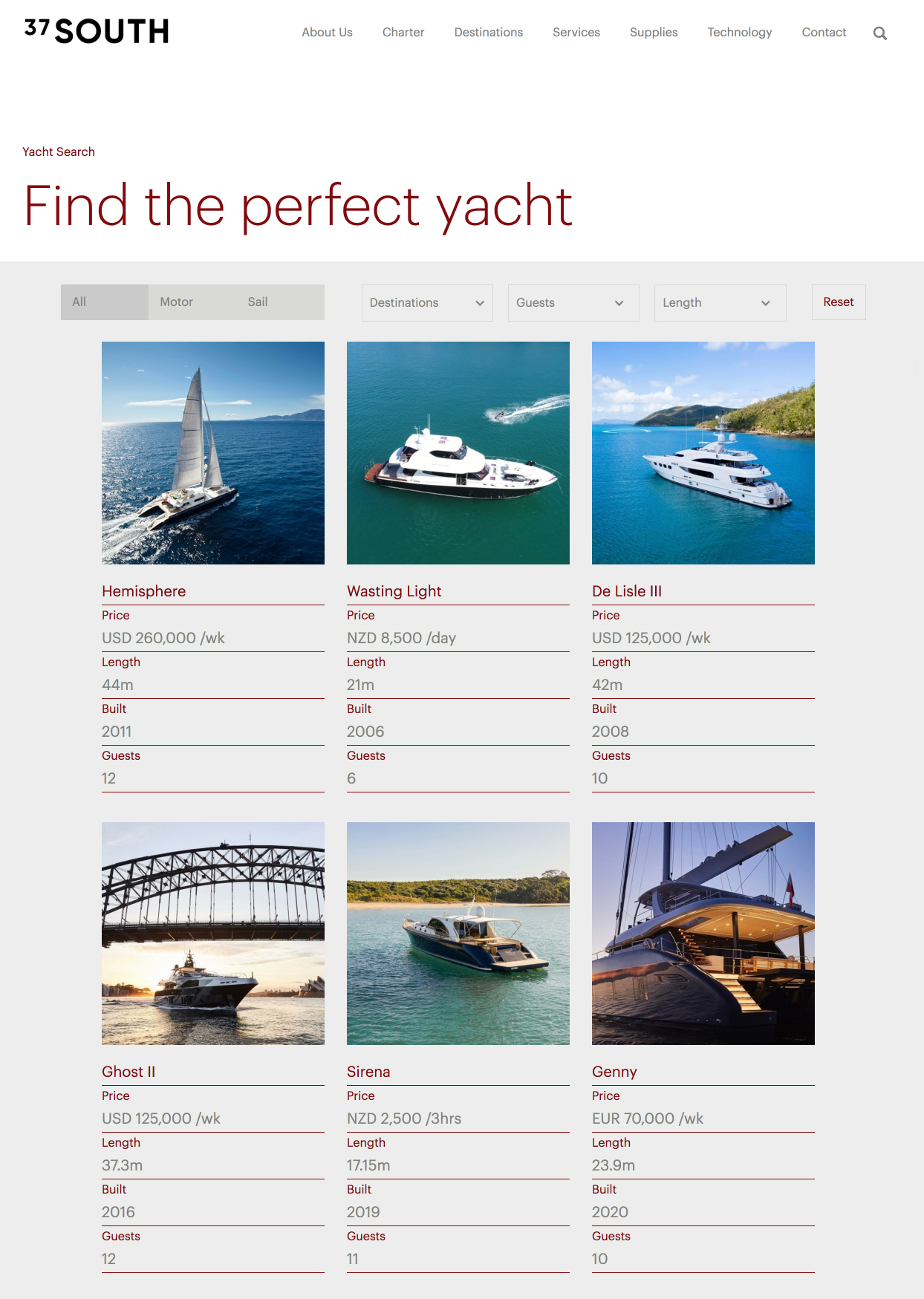
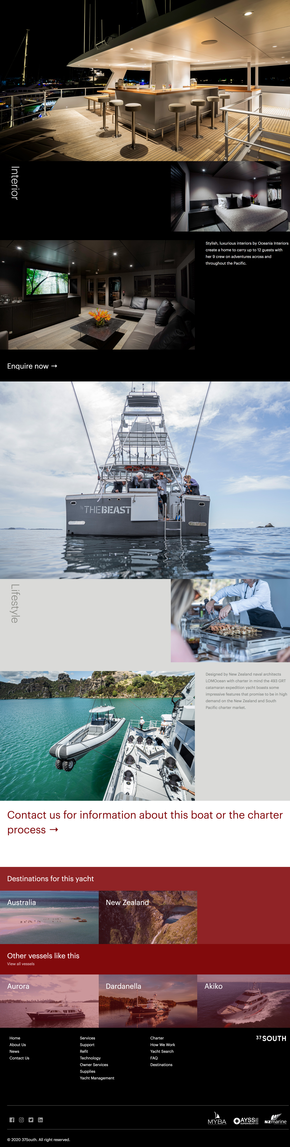
37 South
Elevating the digital presence of the South Pacific’s premier superyacht provider.
Design Director
David Bourke
Team Members
Jungie Choi
David Bourke
Team Members
Jungie Choi
37 South is the foremost full-service superyacht support provider in the South Pacific, offering seamless expertise across some of the world’s most remote and demanding waters. At the core of the brand is a philosophy of effortless progression. Every client interaction is guided with clarity and confidence, enabling owners and crews to focus on the journey while 37 South manages every operational detail with precision and discretion.
To embody this purpose, the brand and website were fully reimagined and rebuilt in Webflow. The refreshed identity and digital experience convey calm authority and intuitive navigation—reflecting the smooth, stress-free voyages that define the 37 South experience.
To embody this purpose, the brand and website were fully reimagined and rebuilt in Webflow. The refreshed identity and digital experience convey calm authority and intuitive navigation—reflecting the smooth, stress-free voyages that define the 37 South experience.